
The best dark blue paint colours
I want to show you what I believe are the best dark blue paint colours on the market. Dark blue is a popular colour choice at the moment, especially now that winter us upon us and we feel the need to turn the lights down low and hibernate. It is such a cosy, cocooning, yet also elegant colour, whether it's an entire room cloaked in its velvety hues or simply one wall.
With all the different ranges of paint on the market today, it can be difficult to find the right colour for your particular home, so here's my pick of the best dark blue paints out there and how they can work throughout different lights and times of day.
1. Farrow & Ball Inchyra Blue
Starting with the slightly lighter end of the dark blue scale here with Farrow & Ball's Inchyra Blue. Released as one of their new colours in 2016, this gorgeously soft blue-grey was originally used in a Scottish country house to work alongside the moody grey skies, so I reckon it's a pretty perfect shade for our inclement weather!

It has an almost teal-like tint to it, so works well with blues and greens as shown in the living room scheme below.

Source @galabeerandthedog_vintage
Inchyra Blue works with pinks, deep reds, bright golden yellows and crisp white. It looks more blue in a north or east facing light, turning to greyer tones come evening (or in a west facing room). Team it with gold or brass metallics and vintage/retro furnishings for an eclectic vibe. It also looks super with Scandi whites and light or blonde woods.
2. Farrow & Ball Stiffkey Blue
Next up is Stiffkey Blue, a deeper navy blue shade that looks incredibly dramatic when used on all four walls as seen below. It works really well with light greys and pops of warm colour, but also looks fab when used alongside pure white, in a bathroom, for example.
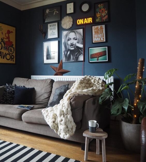
Source - Kerry Lockwood
Stiffkey Blue becomes much deeper and inkier come evening time and like many of the dark blues, it likes to be paired with warm metallics.
3. Little Greene Juniper Ash
A colour from the Little Greene range next, Juniper Ash is a beautiful dusky blue, almost like the blueberry streaks you can see in the dawn sunrise.
Here it is set off with pure white and gold accents in a dining space. It has a nice softness to it, so also works with pastel colours, such as pale pink, cream or powder blue.

Source - Over at Kate’s
It has a much greyer tinge in this living room scheme alongside the muted greys, creams and charcoal accents. I think it's a lovely warm blue-grey that looks very elegant painted right up to the ceiling as shown here.

Source - Claire Elise Interiors
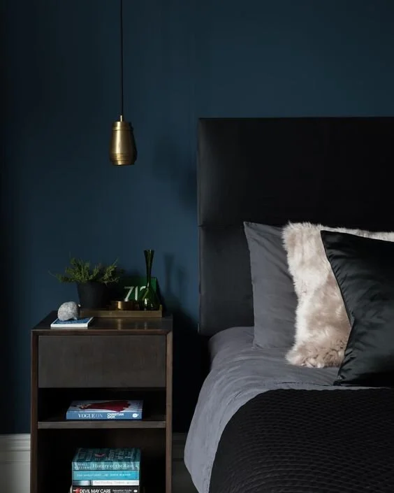
4. Little Greene Hick’s Blue
This is another great Little Greene colour that is deeper than Juniper Ash, but not quite as dark as the likes of Stiffkey Blue. Hick's Blue has a definite hint of teal about it, however with the changing light throughout the day, can become more marine blue.
Here it is used as a cabinet colour in a modern, all-white open plan kitchen. It really pops against the pale worktop surfaces and looks incredible with the blonde wood flooring, doesn't it?

I also love it in this bedroom, used to create a cosy, cocooning effect and offset with warm metallic accents and deep charcoals and greys. I really like the pops of green in there, too.
5. Farrow & Ball Hague Blue
I couldn't compile a list of the best dark blues without including the infamous Hague Blue by Farrow & Ball, now could I?! This deep, strong shade of navy blue works as effectively with a pop of bright orange as it does alongside soft pinks, meaning it's a versatile colour that can fit into many styles of interior.
I adore it in this rustic modern dining room - it looks fab beside the exposed brickwork of the fireplace. It would work well in an industrial setting, too, with either brass or brushed chrome metallic accents.

This next picture demonstrates how well it can work with red accents in the room - it's the perfect navy blue for a cosy library corner, isn't it?
Team Hague Blue with warmer woods, worn brown leather and pops of bright colour for a cosy, eclectic feel. For a calming vibe, pair it with light pinks, pale greys and creams.

Source - Emily Henderson
6. Dulux Sapphire Salute
Going darker again here with Dulux Sapphire Salute, a definite true navy blue with no hints of green in there. It works beautifully when used as an accent wall, perhaps behind a bed or in an alcove to add a bit of depth. I love it with the pale blue chairs in the picture below.

Source - Pinterest
7. Farrow& Ball Railings
Last but not least, one of my personal favourites, Farrow & Ball's Railings, an incredibly rich, deep shade of dark blue that can almost look black in certain light. Some might say it's really a black paint with blue undertones, but either way, I think it's really elegant and inviting.
It's a popular colour on kitchen islands and cabinets, as well as on front doors, where its handsome depth makes an impressive welcome to an entryway.

Here it looks inky black in this Victorian hallway. It's very striking used in this way and can be used to define period features in a contemporary manner.

Finally, here it seen painted onto wood paneling; its soft, chalky finish is a gorgeous backdrop to the zingy orange velvet chair! The light coming in from the right of this picture gives it a much bluer hue.
I would suggest that Railings works better as a feature or accent colour within a room. I think this allows it to stand out on its own, rather than envelope a space just a little too much ... perhaps try the slightly greyer or more teal-coloured dark blues for a whole room makeover.

So, which is your favourite?
K x